INRIX
Time Frame:
2020 - Present
Role:
Director of User Experience
Experience:
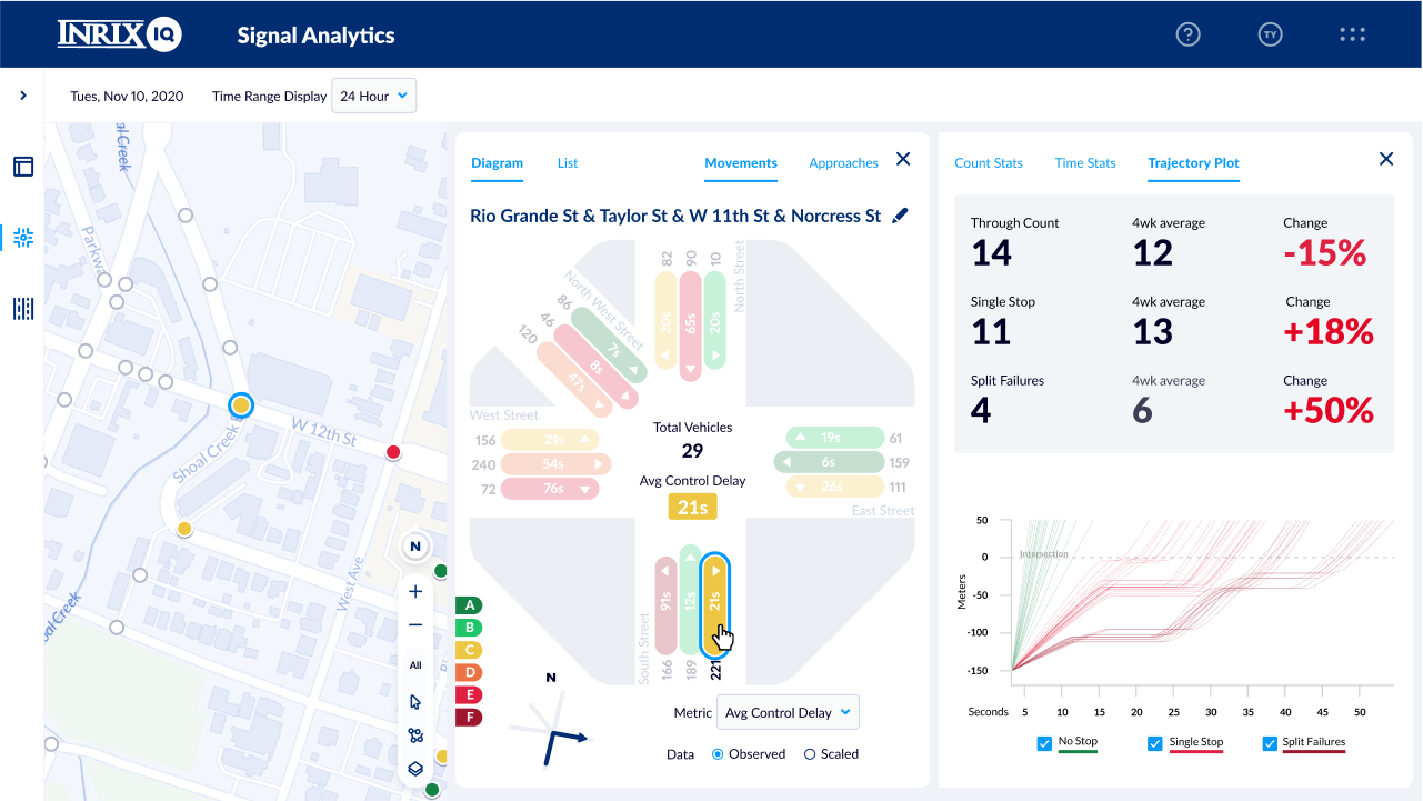
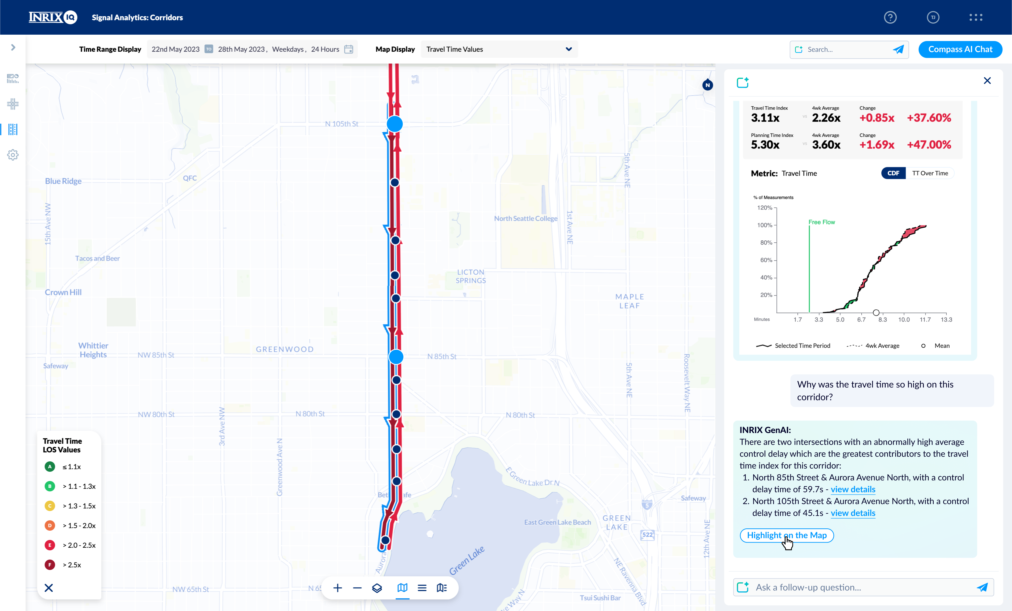
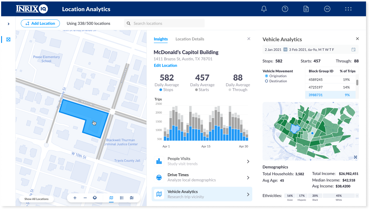
Lead the development of SaaS products with a focus on user-centric design and innovative AI implementations, directly managing a diverse UX team and collaborating with cross-functional groups including Product Management, Engineering, and Executive Leadership. Key achievements include launching 6 new products in public sector, enterprise, automotive, and financial services, contributing to significant revenue growth.
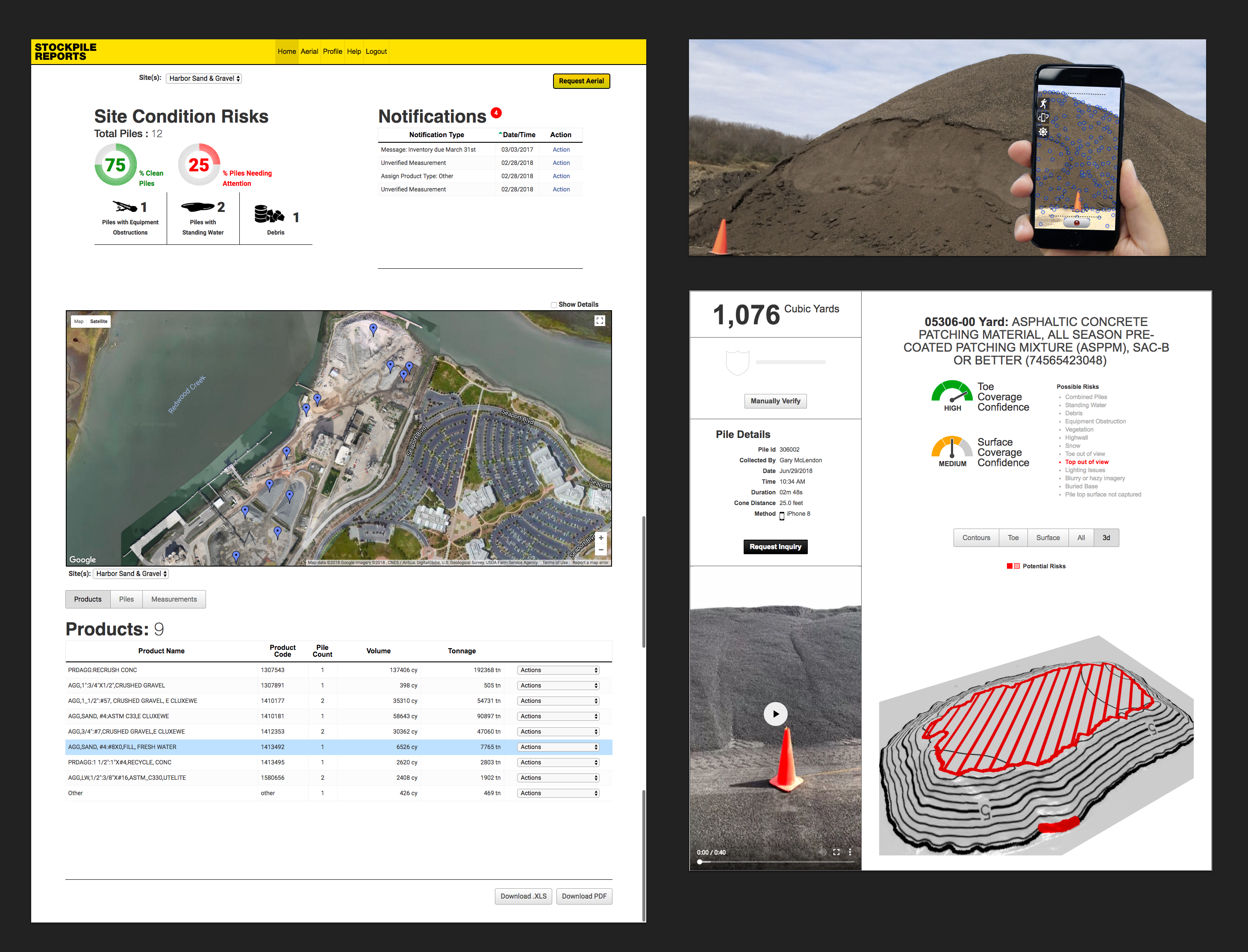
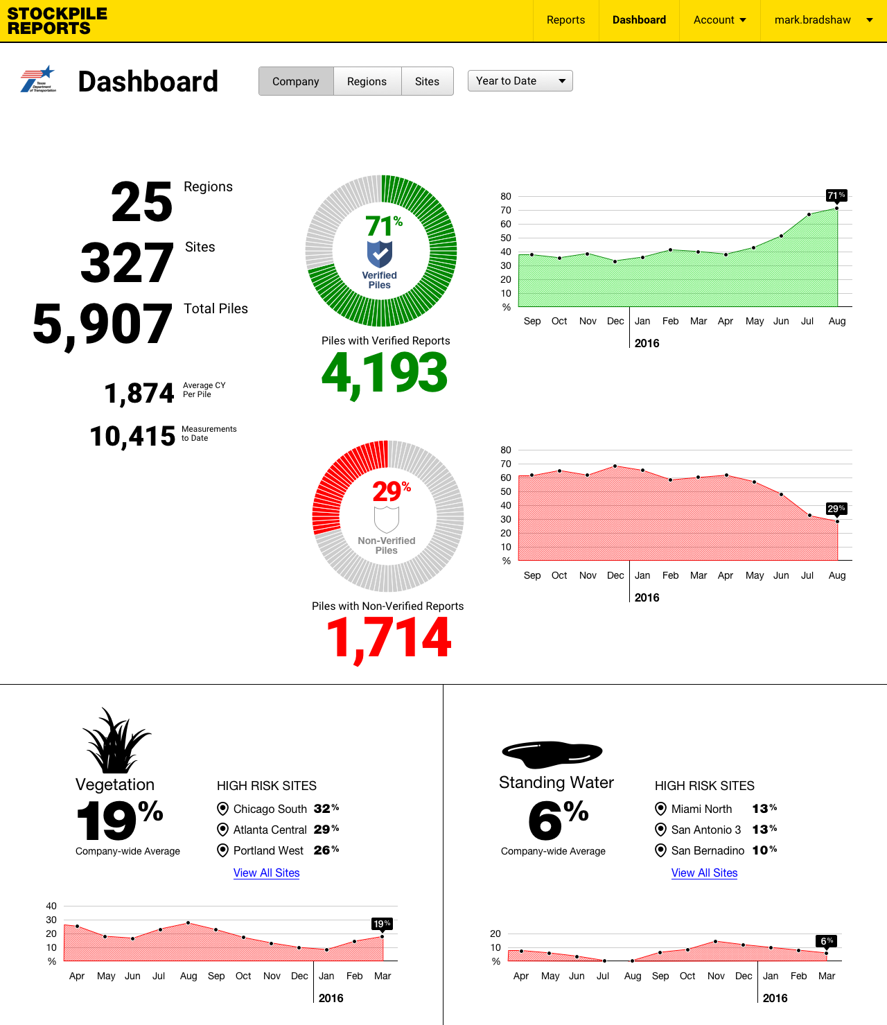
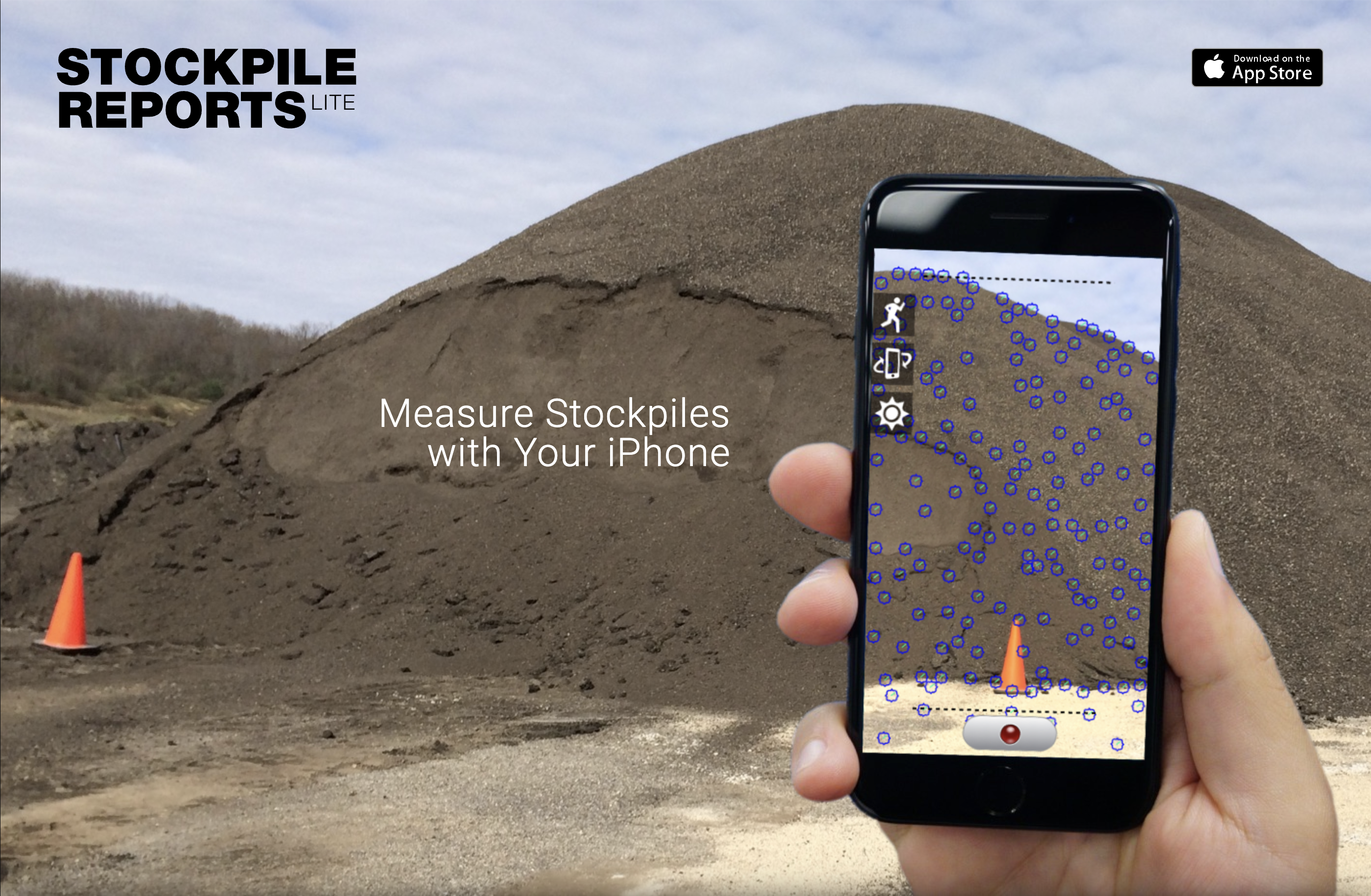
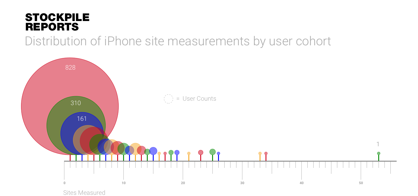
Everypoint.io / Stockpile Reports
Time Frame:
2016 - 2020
Role:
VP of Product
Experience:
Set strategic product vision, leading UX and Engineering teams to develop cutting-edge computer vision technologies and 3D point cloud analytics for construction materials industry. Spearheaded technology and product line development, focusing on user experience and technical excellence.
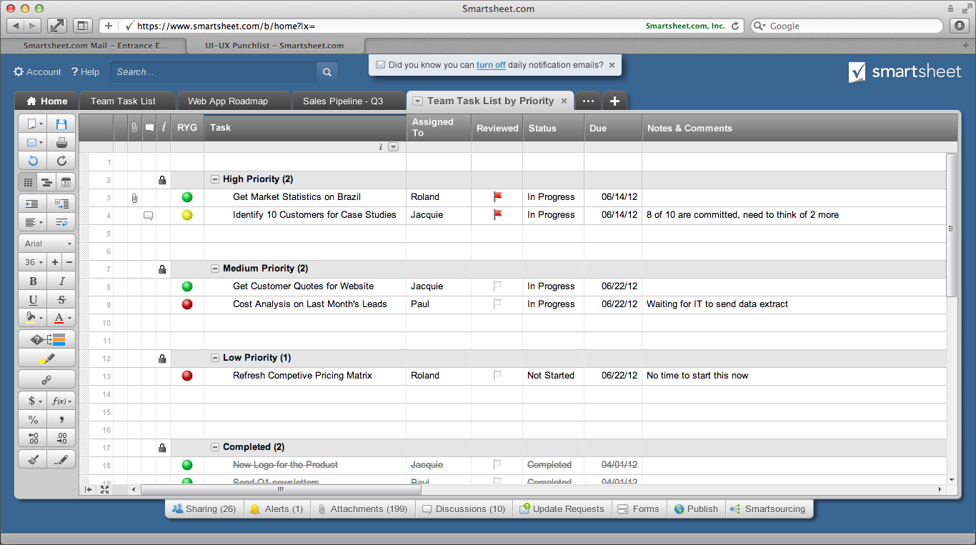
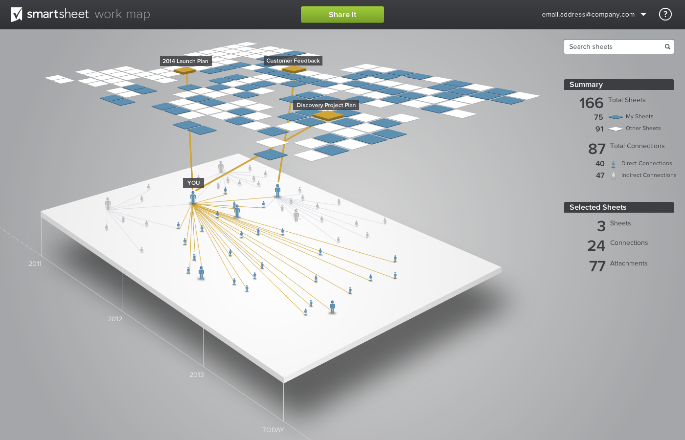
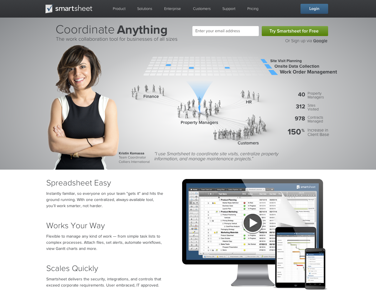
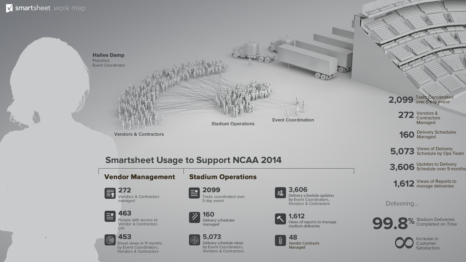
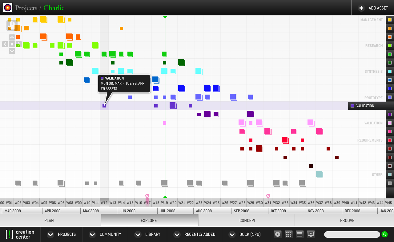
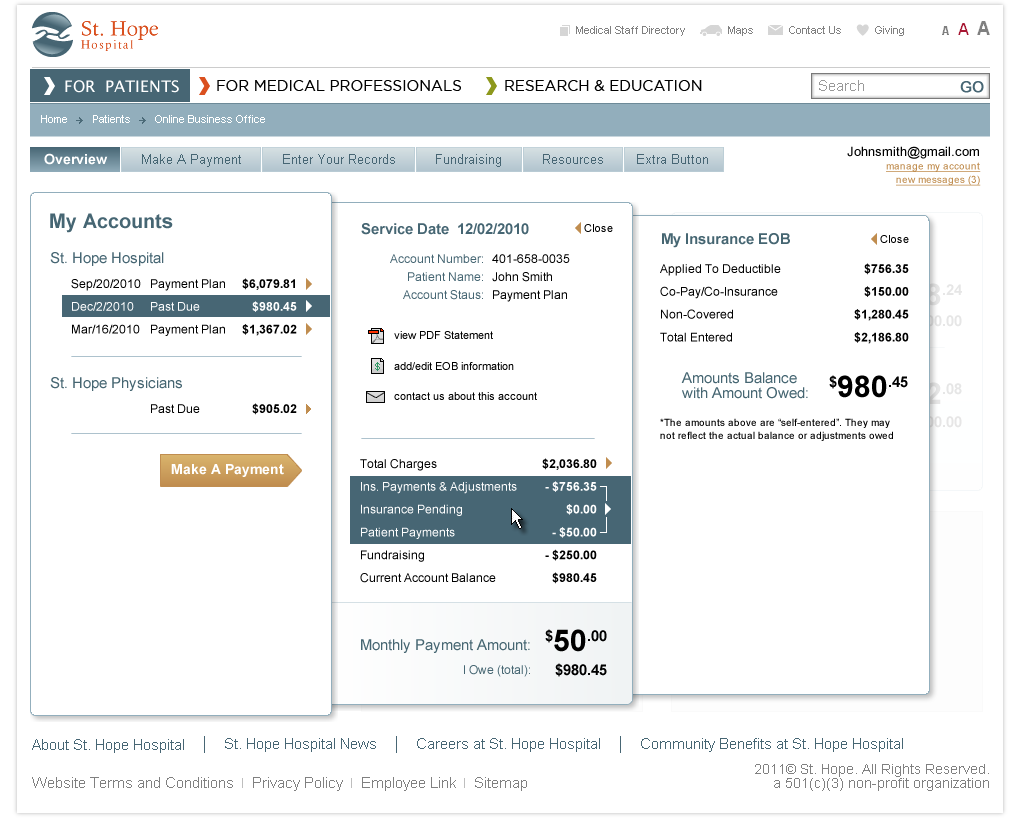
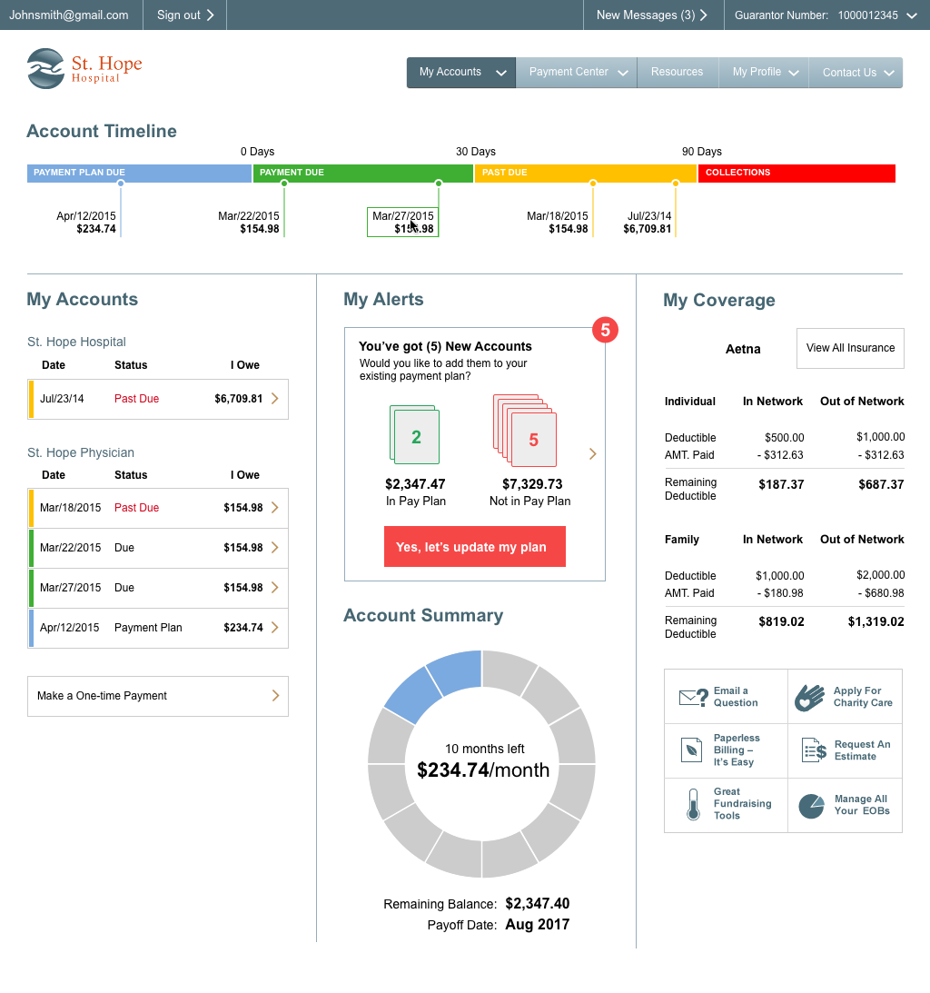
Smartsheet.com
Time Frame:
2012 - 2016
Role:
Director of User Experience
Experience:
As one of the early members, led the transformation of Smartsheet into a world-class SaaS application through user experience strategy and design. Built and managed Product UX and Marketing Design teams, contributing to significant ARR growth through a major product redesign.
Real Networks
Time Frame:
2010 - 2012
Role:
Director of User Experience
Experience:
Directed the UX team in developing a cloud-based media management app, focusing on mobile and desktop integration. Led UX concepting, UI design, user testing, and played a key role in cross-functional collaboration.
Ratio Interactive
Time Frame:
2005 - 2010
Role:
Co-founder and Chief Experience Officer
Experience:
Co-founded and led UX and Design, overseeing UX Strategy, UI Design, and Development. Developed proprietary processes for high-quality project delivery, contributing to the agency's success and acquisition.
The Dual Group
Time Frame:
2003 - 2005
Role:
Co-founder / Designer / Developer
Experience:
Co-founded and contributed to UI development and product design, leading to the successful launch of a Content Management System and securing the first 10 paying customers. Played a crucial role in client acquisition and award-winning design projects.
CrashShop
Time Frame:
2001 - 2003
Role:
Co-founder / Designer / Developer / Deal Maker
Experience:
As a co-founder, led new business development and project management. Specialized in UX Design, UI Design, and Development, contributing to multiple award-winning projects.
CVS.com
Time Frame:
2000 - 2001
Role:
Designer
Experience:
Specialized in UI design and product branding, enhancing the ecommerce experience for CVS.com.
Independent Consultant
Time Frame:
1999 - 2000
Role:
Designer / Developer
Experience:
Provided expert design and development services to a variety of clients in the Seattle area, including notable companies like Microsoft and CVS Pharmacy.
Costco.com
Time Frame:
1995 - 1998
Role:
Designer / Developer
Experience:
Transitioned Costco from a content site to its initial ecommerce platform, contributing to the early digital transformation of the company.
Costco Wholesale
Time Frame:
1985 - 1995
Role:
Carts > Boxer > Cashier > Supervisor
Experience:
Make happy customers and help the warehouse run smoothly and efficiently.
School of Visual Concepts
1998 - 1999
Graphic Design & Advertising
Edmonds Community College
1992 - 1993
Digital Music Production
Northwest University
1988 - 1990
Music Composition & Performance
Highline Community College
1986 - 1988
General Studies